
My
drawings almost never looked as well staged or technically
executed as I had pictured them in my imagination,
Barks once stated in an interview. One can only wonder how
drawings of his degree of perfection might have been bettered!!!
When constructing the comic book pages, Barks must have been
using some kind of a magic wand as they all bear the sign of
being well thought through. The panels interact with each other,
'forcing' the reader to go on reading. Barks invented several
fantastic, yet effective, layout devices as he went along.
It is well worth remembering that at the time Barks produced his
comic book stories, a normal page by most other artists would
contain only 8 square standard panels on each page. Nothing fancy.
But Barks enriched the industry by introducing a variety of new
ideas to his stories. This page displays a few samples of his
brilliant layout abilities.
| OPENERS | |
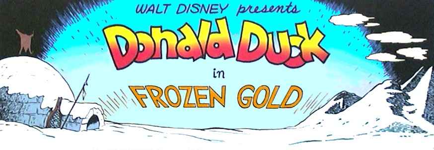 FC0062 Frozen Gold |
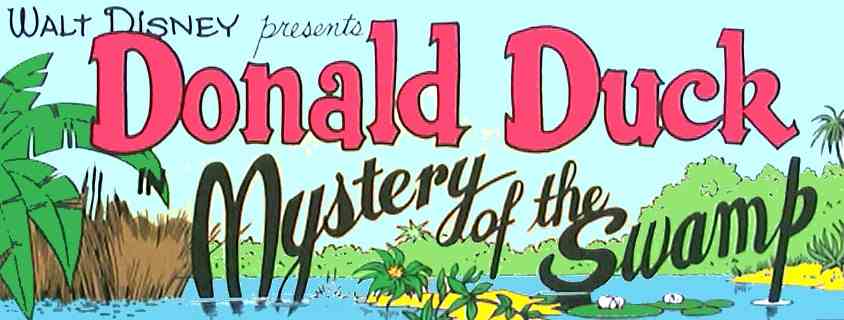 FC0062 Mystery of the Swamp |
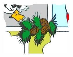
| In some of his first FC-stories Barks experimented with an opening panel that would set the tone for the upcoming story. These panels are pure masterpieces - almost more like poetic paintings. It seems a shame that he stopped doing these panels after a while. | |
| HEADINGS |
 |
 |
 |
| On top of every page in the first few WDCS's Barks drew a strip which showed the reader some of the content. These 'overheads' are especially interesting because they represent the very first inking Garé did in her husband's comics. |
| SPLASH PANELS | |
 FC0386 |
 WDCS158 |
 U$05 |
 WDCS149 |
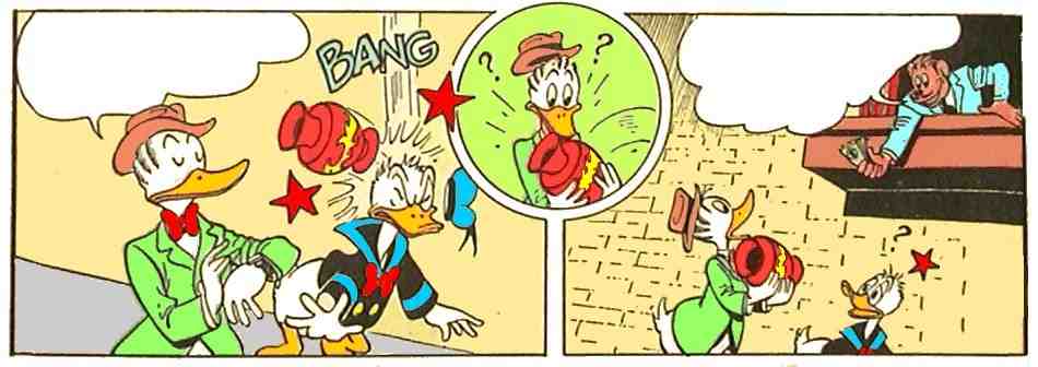
| Barks was very proud of his numerous big splash panels which took him a long time to compose. At the time most artists did not bother to produce that kind of time consuming panels - but Barks did! | |
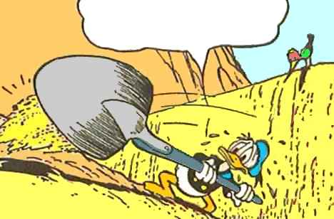
| MAGNIFYING-GLASS EFFECTS | ||||
 FC0291 |
 WDCS111 |
 FC0456 |
 FC0223 |
 CP1 |
| What better way to emphasize the importance of a panel than to use a magnifying-glass effect? Barks mastered this layout style. | ||||
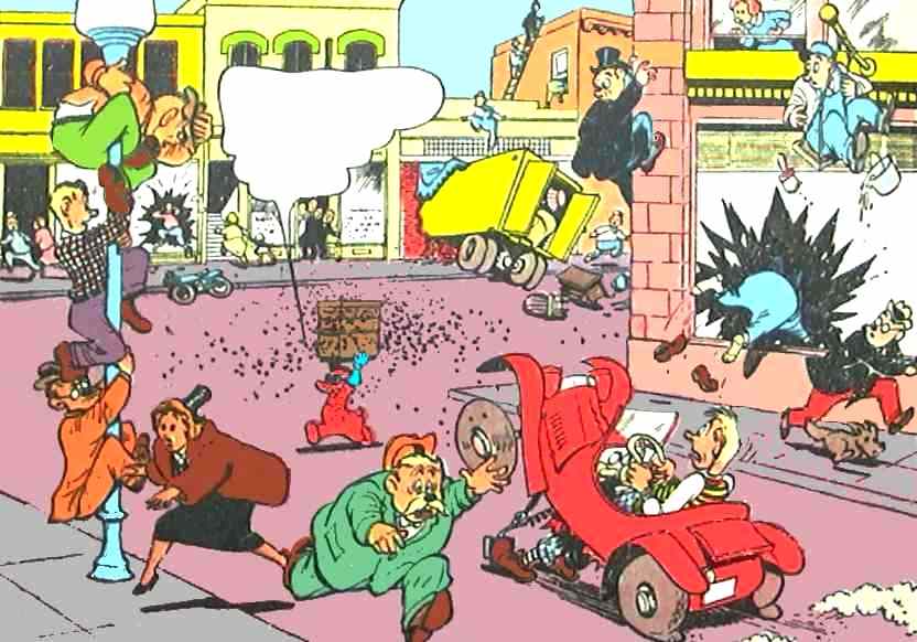
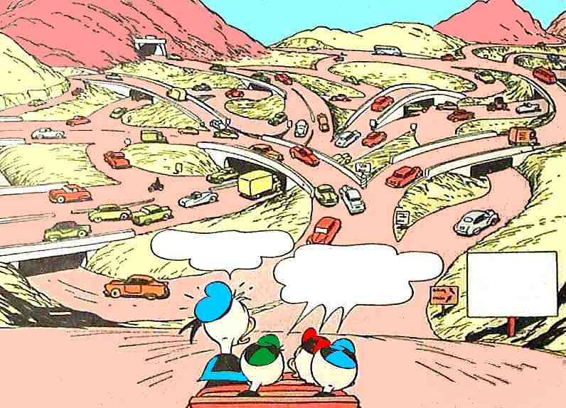
| PERSPECTIVE | ||
 OG30/1947 |
 FC0300 |
 WDCS103 |
| A few times Barks experimented with perspective in order to let the panels have some sort of a 3D-effect. It was not used very often but it was certainly a new thing in those days. | ||
| ELASTIC PANELS | |
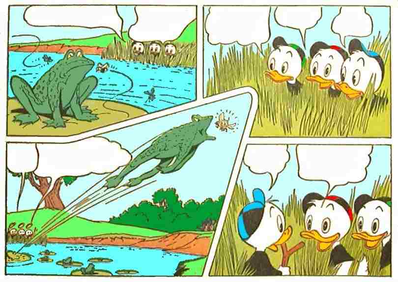 WDCS108 |
 WDCS150 |
 WDCS081 |
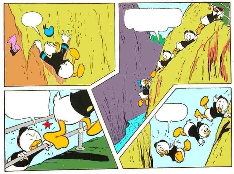 WDCS228 |
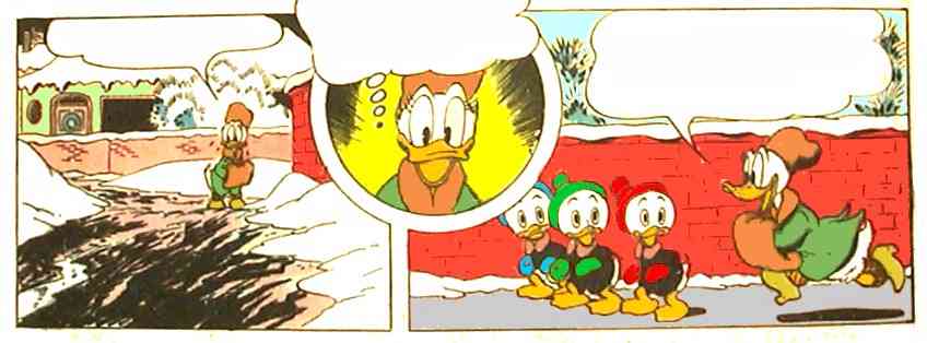
| In those days, artists did not often experiment with the fixed formats of the panels - but Barks did. Not for the sake of doing something spectacular, but simply because the broken frames served a purpose. They were a simple and logical way of showing a 'long' panel. Today no-one would hardly lift an eyebrow over Barks' progressive art, but it was a novelty at the time. Here are a few examples of both upwards and downwards action... | |
| VIGNETTES | ||||
 WDCS117 |
  CP1 |
|||
| Barks enjoyed placing small vignettes between his panels just for the fun of it. They had no bearing on the story but they added a great deal of atmosphere. Here are examples from two stories. | ||||
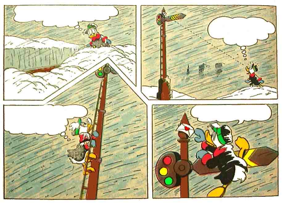
| FRAME-IN-FRAMES | |
 WDCS131 |
 FC0367 |
| Barks found a solution to a most practical problem that would present itself from time to time in the otherwise strict format of two panels in a row. The problem was that sometimes one needed an extra panel in order to show the going-on properly. Barks simply inserted a small round frame between the ordinary ones... | |
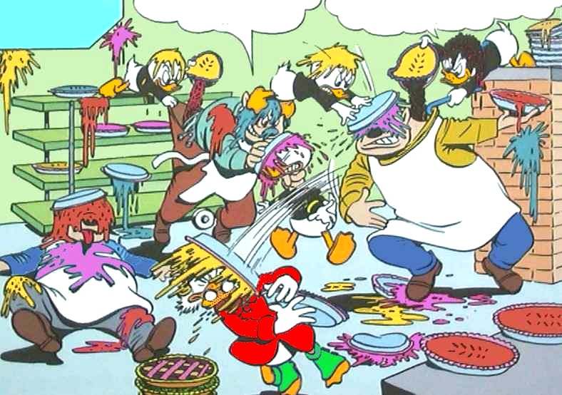
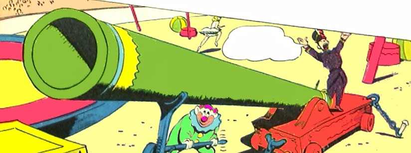
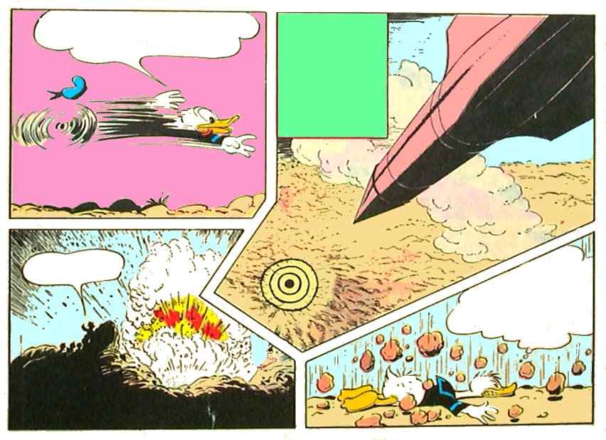
| IRREGULAR PANELS |
| For a period of time Barks experimented with pages in which the panels were all laid out in different sizes and shapes. This is especially noticeable in VP1 Vacation Time from 1950 where he might be suspected of doing it just for kicks. But a closer examination reveals that the layout of every page is in fact, different - in all the realistic pages the frames are more normal looking than in the action ones. In FC0300 Big Top Bedlam from the same year Barks uses the effect much more sparingly and perhaps with more reflection as the effect is used solely in the helter-skelter actions of the circus arena. |
| FORCED LAYOUTS | |
 U$40 Oddball Odyssey |
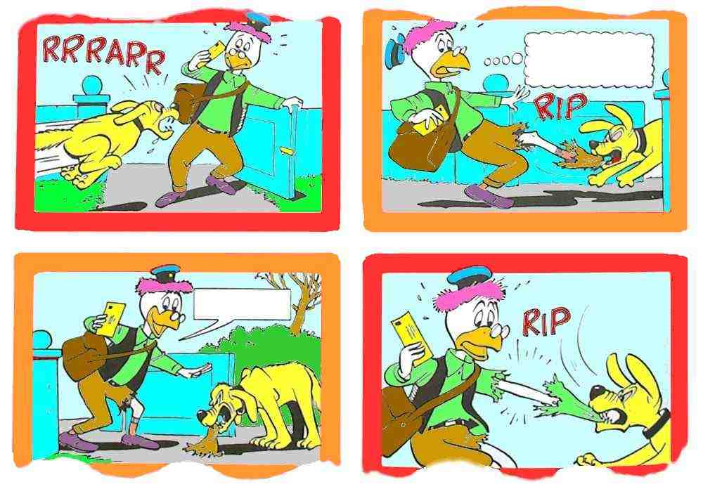 U$40 Posthasty Postman |
| During his time at Western, Barks had to endure editors dictating alterations in formats, as well as changing the style of layouts. But after some time things always went back to normal again. Some of the more 'innocent' changes were that the standard page layouts of four rows of panels were altered to three or five rows a panel. One time the normal four rows - which usually had two panels per row - suddenly got four panels a row! But the worst example of forced layouts happened in 1963 when the editors decided that all the speech balloons should be square ones, and that all the panels should have either no frames or frames of different colours. Luckily, things quickly went back to normal when even the editors realized their restraints had a serious and somewhat ridiculous effect on the artists' work. | |
| http://www.cbarks.dk/THELAYOUTS.htm | Date 2003-07-21 |