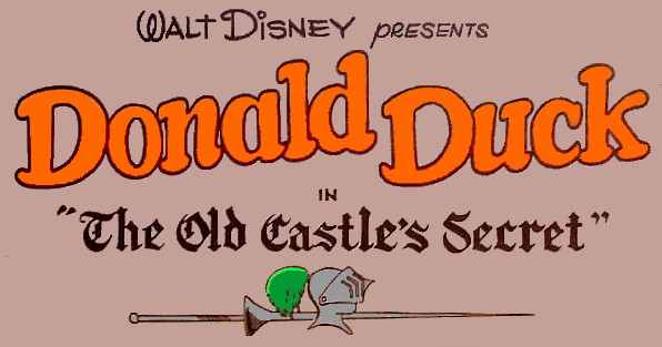
Of course all of Carl Barks' stories featuring primary characters from his duck universe started with the name of the main character of the particular story. These letters, which were also drawn, are - along with the name of the publisher (in this case Walt Disney) and the title of the story, if any - known as the Logo of a story. Although the primary characters tended to have their own font style logos most of the time, they were also quite different from character to character.
This page will give you representative examples of the logos Barks used for his stories. It is important to notice that Barks did not invent all of the logos.
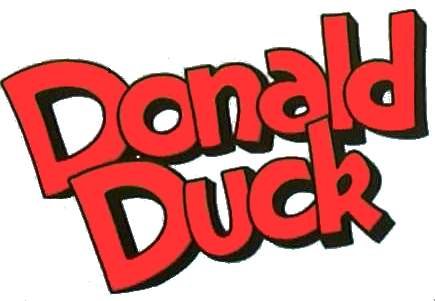
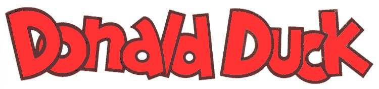
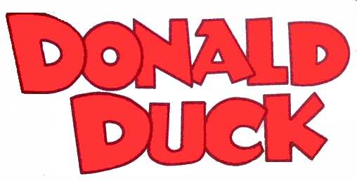
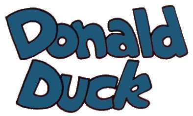
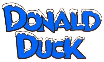
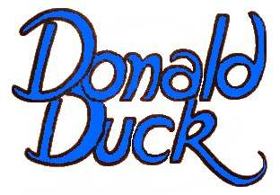
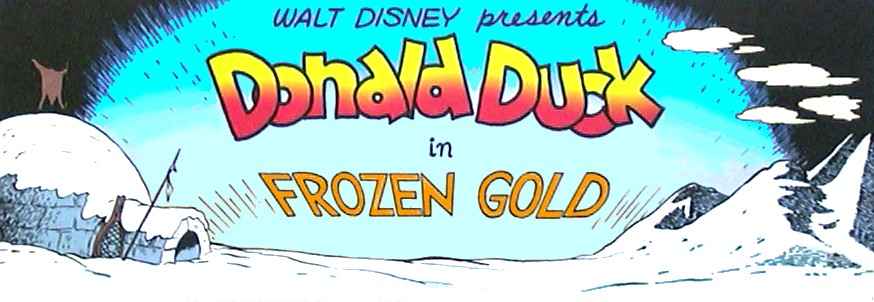
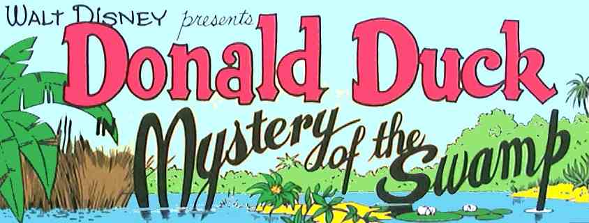


DONALD DUCK STORIES

10-PAGERS

WDCS167
 
WDCS271
 
WDCS059
 
By far the most often used Donald Duck logo for the WDCS 10-pagers was the one illustrated above (WDCS167). The logo was slightly tilted, the Ds are drawn as capital letters and all the following ones are somewhat overlaying and a bit tumbled rendering them with a lively overall appearance. Furthermore, the logo had an efficient shadow effect.
Barks would sometimes deviate from this standard logo. Examples: A similar logo but with a more 'lively' appearance, fatter font style, overlay from the other side, and no shadowing (WDCS271). Only capital letters, fatter font style, little overlay, and no shadowing (WDCS059).
1-PAGERS

FC0199
 
FC0256
 
FC0263
 
For the 1-pagers Barks would often create different logos as he went along. These few examples give you an idea of his diversity and inventiveness despite the very restricted creative possibilities.
ONESHOTS

FC0062 Frozen Gold
 
FC0062 Mystery of the Swamp
 
FC0159 The Old Castle's Secret
 
In his long Donald Duck adventures Barks frequently created special atmosphere-oozing logos and titles to suit the individual stories.


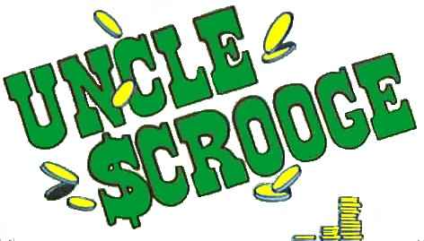
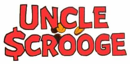
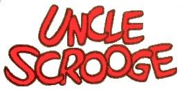
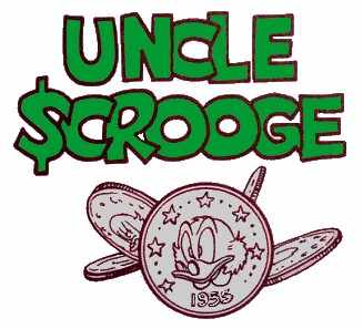
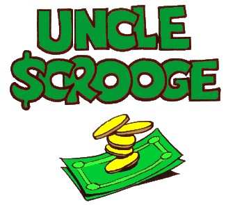
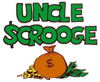
UNCLE SCROOGE STORIES

ONESHOTS

U$05
 
FC0456
 
U$32
 
The vast majority of Barks' U$-stories start with an impressive logo (U$05). It is tilted more than the standard Donald Duck logo, but it has a font that is reminiscent of the old Wild West Wanted posters. The decoratively placed coins need no special explanation - they are a natural ingredient considering the starring character! For many years Barks used the gimmick of using the American dollar sign ($) instead of an ordinary S in Scrooge which also contributes to our understanding of the character. The dollar sign functioned almost as a trademark inside the logo. You can see a collection of splash pages incorporating the logo HERE.
Barks would sometimes deviate from this standard logo. Examples: A similar logo - in another font style, though - but without the tilting. Coins and dollar sign remained (FC0456). As time went by Barks would occasionally alter the logo drastically (U$32). In the last years he merely used a simple font presented in black letters (see under BONUS).
1-PAGERS

FC0495
 
FC0495
 
U$04
 
The logos in Barks' 1-pagers always varied greatly. He used the same font style but added different mini-pictures beneath. Besides those shown he added pictures of overflowing money barrels, varying stacks of money, a wheelbarrow filled with money, and many more - all natural choices considering the main character.


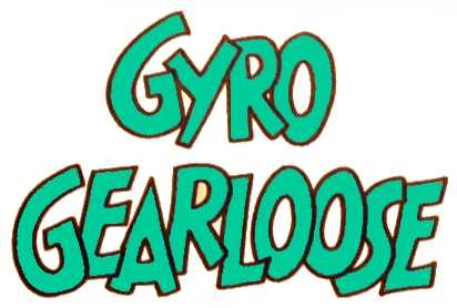
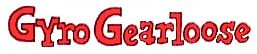
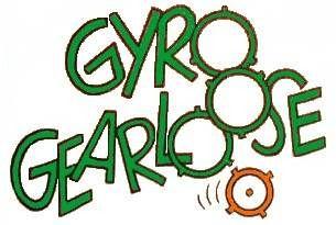
GYRO GEARLOOSE STORIES
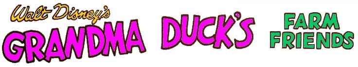
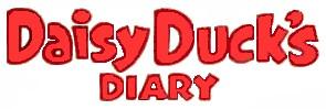

VP1
 
U$34
 
FC1047
 
Barks primarily used two different font styles on the Gyro splash pages; one that resembled the Donald logo (VP01) and one that resembled the Scrooge logo (U$34). At times he would invent a more 'personal' oriented logo for Gyro as in this one (FC1047) where the three Os are substituted with gears, and there is even one extra taking off - a gear loose...


LADIES' STORIES


FC1010
 
FC1150
     
In 1959 and 1960 Barks contributed to two series featuring Grandma Duck (FC1010) and Daisy Duck (FC1150). The respective logos were presumably created before his stories, because they - especially the first - are not quite up to his usual standards. It simply lacks composition.


BONUS


U$61

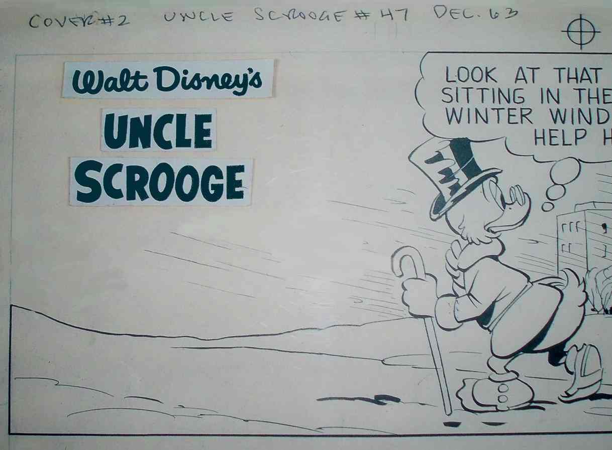
In the later stories - especially the ones starring Gyro and Grandma - Barks would often use a simple black font style. The logos were photocopied and after a quick cut-and-paste session using the available strips the logo was ready. This spared Barks of great amounts of tedious work and is also the reason why the logos are totally identical in the comic books. The uncomplicated technique is presented above (the example comes from one of many Scrooge 1-pagers).


http://www.cbarks.dk/THELOGOS.htm   Date 2007-04-24